|
|
Scatter Plot
A scatter plot is a type of diagram using Cartesian coordinates to display values for two variables within a set of data. The data is displayed as a collection of points, each having the value of one variable determining the position on the horizontal axis and the value of the other variable determining the position on the vertical axis.
A simple scatter plot can be created in R with the plot function. In the example below, data from the sample "cars" dataset is used to plot the car speed vs car stopping distance. plot(NumericVectorX, NumericVectorY) Example:
> plot(cars$speed, cars$dist) 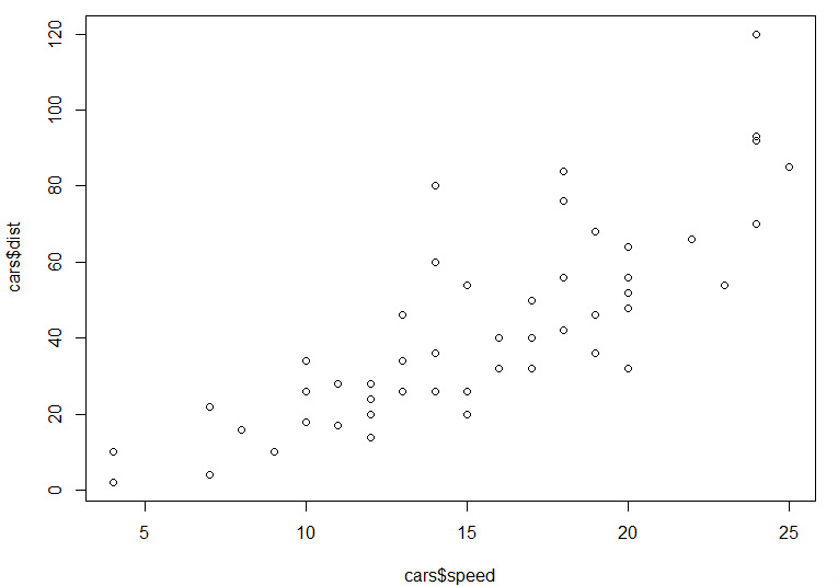
The resulting scatter plot is very simple. However, users can define arguments to fully customize the appearance of the plot. Each argument is entered within the plot function and separated by a comma. When using the plot function it's often easiest to start with a standard template that lists the most common arguments with a NULL or DEFAULT value (example below). The user can then define whatever arguments they choose to customize the plot.
plot(NumericVectorX, NumericVectorY, IMPORTANT NOTES:
The format of the above string includes extra returns after each argument. R does not recognize extra returns in a string, the extra returns are included to make visual identification of each argument quicker and easier. Common Bar Plot Arguments
Definitions and examples for a few of the more common arguments are provided in the table below. View the subpages under Data Visualization > Scatter Plot to learn more about the use of these arguments in scatter plots.
|
