|
|
Customize Labels / Titles
The following sections detail how to add and customize a variety of labels / titles common to bar plots. Add x-axis Labels
The simplest form of the bar plot doesn't include labels on the x-axis. To add labels , a user must define the names.arg argument. In the example below, data from the sample "pressure" dataset is used to plot the vapor pressure of Mercury as a function of temperature. The x-axis labels (temperature) are added to the plot. barplot(ElementContainingData, names.arg = ElementContainingNames ) Example: > barplot(pressure$pressure, names.arg = pressure$temperature) 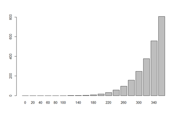
Customize Axis Labels
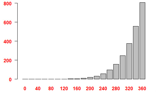
The font, color, and orientation of the axis labels can be customized per the font.axis, col.axis, and las arguments. barplot(ElementContainingData, font.axis = FontValue, col.axis = "Color", las = OrientationValue ) Font Values:
Orientation Value: 0. Y = Vertical, X = Horizontal 1. Y = Horizontal, X = Horizontal 2. Y = Horizontal, X = Vertical 3. Y = Vertical, X = Vertical Example > barplot(pressure$pressure, names.arg = pressure$temperature, font.axis = 2, col.axis = "Red", las = 1 ) Click to set custom HTML
Add Axis Titles
Axis titles can be added via the xlab and ylab arguments. barplot(ElementContainingData, xlab = "LabelText", ylab = "LabelText" ) Example > barplot(pressure$pressure, names.arg = pressure$temperature, xlab = "Temperature", ylab = "Pressure") 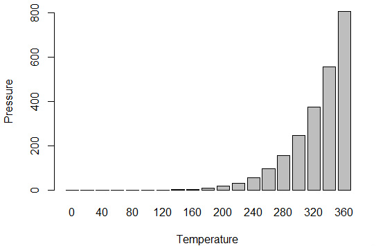
Customize Axis Titles
The font, color, and size of the axis titles can be customized per the font.lab, col.lab, and cex.lab arguments. barplot(ElementContainingData, xlab = "LabelText", ylab = "LabelText", font.lab = FontValue, col.lab = "Color", cex.lab = SizeValue ) Font Values:
Example > barplot(pressure$pressure, names.arg = pressure$temperature, xlab = "Temperature", ylab = "Pressure", font.lab = 2, col.lab = "Red", cex.lab = 1.5) 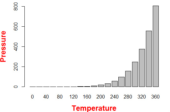
Add Main Title
A title can be added via the main argument. barplot(ElementContainingData, main = "TitleText" ) Example > barplot(pressure$pressure, names.arg = pressure$temperature, main = "Mercury") 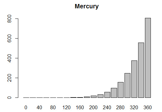
Customize Main Title
The font, color, and size of the main title can be customized per the font.main, col.main, and cex.main arguments. barplot(ElementContainingData, main = "Mercury", font.main = FontValue, col.main = "Color", cex.main = SizeValue ) Font Values:
Example > barplot(pressure$pressure, names.arg = pressure$temperature, main = "Mercury", font.main = 4, col.main = "Red", cex.main = 1.5) 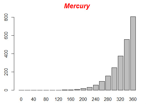
Add Subtitle
A subtitle can be added via the sub argument. barplot(ElementContainingData, sub = "TitleText" ) Example > barplot(pressure$pressure, names.arg = pressure$temperature, sub = "Pressure vs Temperature") 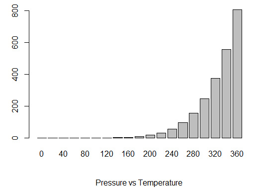
Customize Subtitle
The font, color, and size of the subtitle can be customized per the font.sub, col.sub, and cex.sub arguments. barplot(ElementContainingData, main = "Mercury", font.sub = FontValue, col.sub = "Color", cex.sub = SizeValue ) Font Values:
Example > barplot(pressure$pressure, names.arg = pressure$temperature, sub = "Pressure vs Temperature", font.sub = 4, col.sub = "Red", cex.sub = 1.5) 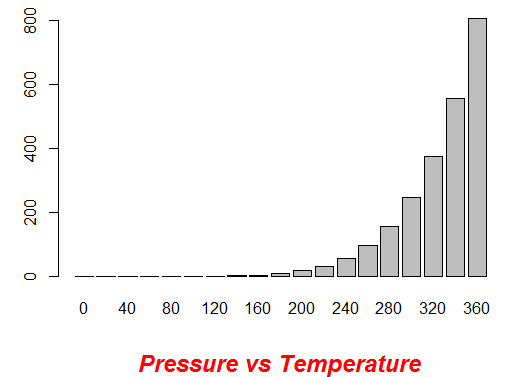
|
